
How do you feel about your logo? Is it the perfect representation of your brand? Does it communicate quickly and clearly who you are? Does it capture and portray your brand’s unique personality? Is it easily reproduced in all forms (print and digital)?
There are plenty of reasons brands change or update their logos. But it’s always a weighty decision, and can drive customers away if done wrong (I’m looking at you, Gap). A company’s logo is the face of the brand. It’s the identity that lets people know who they’re dealing with, instantly. It’s a big deal. People identify with logos, and may dissociate if they feel the updated branding no longer speaks to them. So, while it’s important to build a connection and trust with customers, it’s also important to know when it’s time to evolve.
This shouldn’t be done on a whim, however. It’s important that your decisions be driven by research and informed by customer insights and solid strategy.
There are three strong indicators of when it’s time to update (or change) your logo.
Valid reasons to update a logo:
Reason #1:
Your logo feels dated and old, reflecting poorly on the brand.
When was the last time you revisited your logo and brand identity? If it’s been more than 15 years, it might be time for a refresh or an update. A lot has changed in the past decade. Consumers have evolved. Online and digital experiences have evolved. I’m sure your brand and products have evolved, as well. Your logo and identity need to evolve, too. If your logo looks dated, it will likely reflect poorly on the perception of your brand.
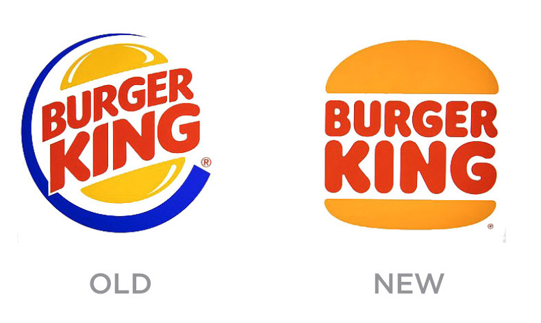
Take Burger King, for example. They recently rebranded for the first time in 20 years, ditching their previous logo, introduced in 1999, in favor of a flat, simplified design that is more aligned with the iconic logo used by the brand in their heyday. The old logo was a reflection of bad ‘90s design—a blue ‘swoosh’ encircling the logo—an unnecessary element, along with shiny highlights on the bun (ahem…buns don’t shine).
Burger King let strategy and solid thinking drive their decision. The logo update was part of a larger brand overhaul in an effort to become more relevant to today’s audience.
Reason #2:
You’ve had a shift in brand strategy.
There comes a time when brands must reevaluate their position in the market. Perhaps they need to appeal to a younger audience. Or maybe the nature of what they sell has evolved. If brands stay stagnant, they die. So constant evolution is necessary. When major changes happen to your business, you may want to reconsider your logo at that time. Does it reflect where you’re headed?
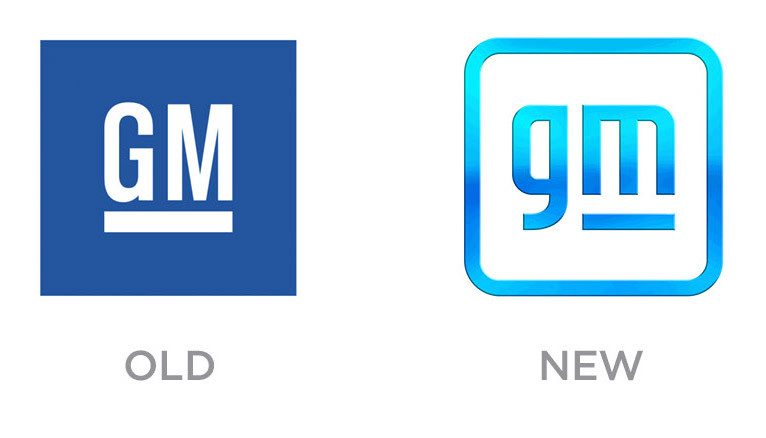
Consider the recent rebranding of General Motors, the first substantial logo change in more than half a century. According to the folks at GM, their newly revealed logo aims to reflect the company’s all-in commitment to the production and sale of electric vehicles. As a company, they’re headed in a new direction. The new, “friendlier” logo uses a brighter blue meant to evoke “the clear skies of a zero-emissions future.” Granted, the new design has gotten some bad press, and some folks aren’t a fan (trust me, everyone’s a critic when it comes to logos), but the strategy and reasoning for the change is rock-solid. They did their homework. Market insights and a new business strategy drove the new direction.
Reason #3:
Your logo needs to be simplified for a digital and mobile world.
A trend in recent years has been a simplification of logo designs, doing away with all the fancy (and unnecessary) Photoshop techniques of shadows and highlights and 3D effects. That’s a good practice in general—simple is better—but today there’s a legit reason to pay special attention to this. The reproduction and representation of logos in digital formats, specifically on social media platforms, require logos to be legible and easy to read when presented at a very small size on a mobile device. How well does your current logo reproduce in all sizes on a variety of applications?
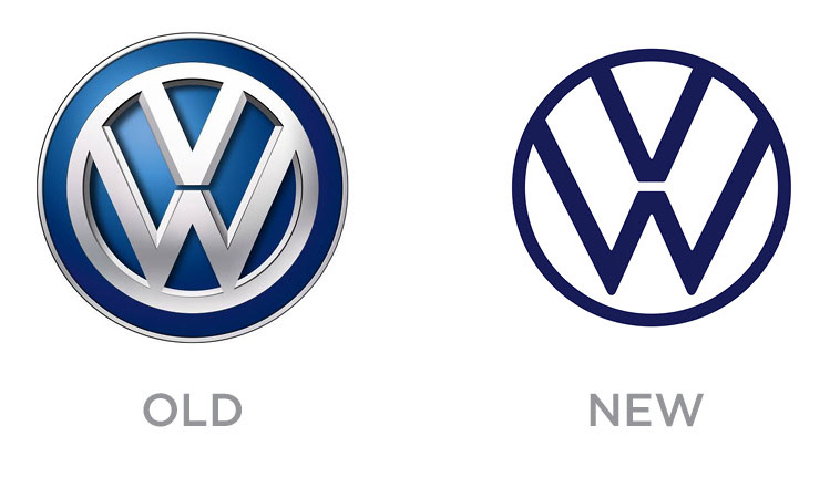
Take a look at Volkswagen’s recent updated logo. It’s merely a streamlined version of their classic logo, simplified for today’s modern uses. They made this change specifically with social media in mind. It reads better at a smaller size. Not as many pixels to render. How did they come to this conclusion? By doing a brand audit and looking at all their consumer touchpoints, looking for things that worked and didn’t work. They tested things. Tried things. Which led them to this simpler solution.
Bad reasons to update a logo:
• Someone “doesn’t like it”
• You’re bored of the current design
• You want your own Nike ‘Swoosh’
• Your nephew is a design student and “has some ideas”
Logo design is both an art and a science. It should be left to the professionals. And remember, you shouldn’t judge a logo based on whether you “like it” or not. No one cares. Good logos are a result of doing your homework, spending time doing research and gathering insights. They should reflect your brand’s personality and convey the positioning of your products. And they need to reproduce well.
When was the last time you took a fresh look at your logo? If it’s been a while and you need some expert advice, give me a shout. We design logos for all kinds of brands, every day.
Tags: brand personality, brand strategy, branding, Brent Niemuth, changing logo, logo, logo design, logo redesign, update logo