
Crate & Barrel, A Story of Unrequited Love

I absolutely love Crate and Barrel. I love the way design meets function, in each and every one of their products. I love walking through their stores, being inspired by what could be. I love that their product designers take inspiration from around the world and bring it home to me. But, do they love me back? Or am I working too hard to make this relationship work?
In PART TWO of our critique series, we continue looking at catalogs through the filter of: DISRUPT; does the catalog stand out and grab my attention? DELIGHT; does the catalog engage, inspire or motivate? And finally, DRIVE; does the catalog encourage me to go online or to the store, to learn more, engage or shop? Let’s dig in …
THREE THINGS CRATE & BARREL DOES SO WELL:
1) Beautiful, Engaging Photography.
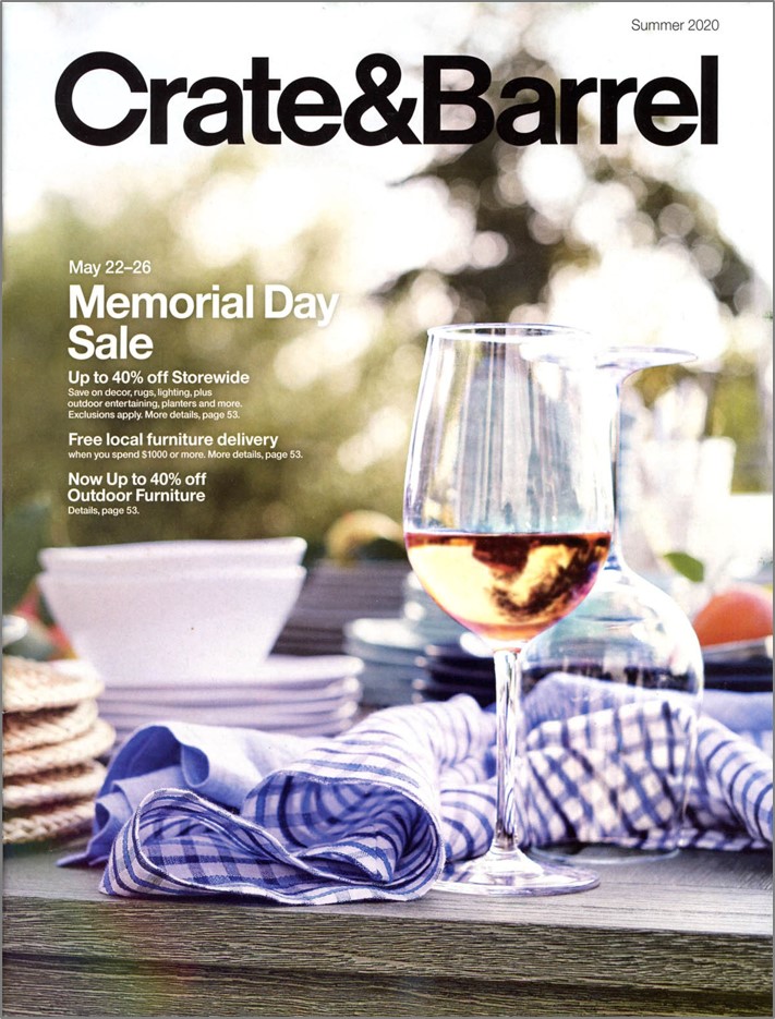
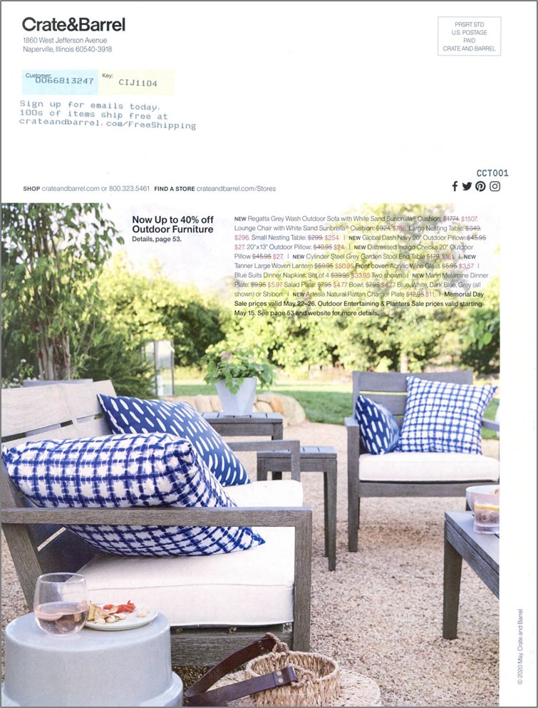
Beginning with the cover, this catalog pulls you in with inspirational imagery, creating a place in time. And by pulling you in, it leads you to important offer copy regarding their Labor Day Sale. This theme is carried throughout the catalog, disrupting the eye by telling a visual story. It’s obvious the creative team spends a lot of time thinking and planning each shot, from location to lighting. Simply put, if Crate and Barrel meets your design aesthetic, then this catalog is pure eye candy.
2) Brilliant Copy.
Creating emotive copy is one of the most difficult tasks, especially because we know most people will not read advertising copy. This catalog does a masterful job of using headlines to connect emotionally and sub-heads to quickly tell the rest of the story. Many people think that “story-telling” equates to long copy. A true copy artist is able to capture a moment with fewer words, not more.
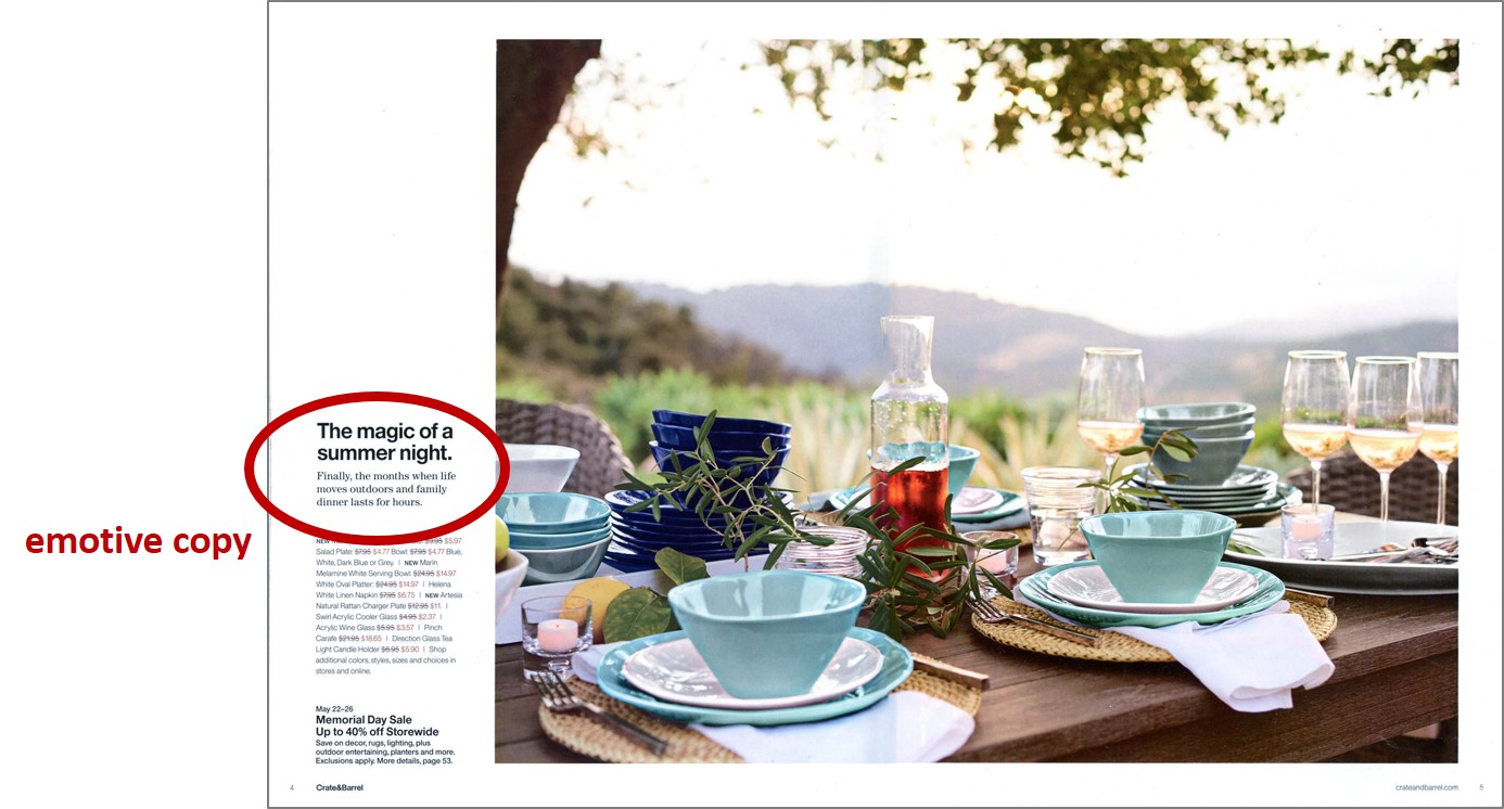
The spread above pulls you in with a scene right out of Tuscany while the copy ties it all together:
“The magic of a summer night. Finally, the months when life moves outdoors and family dinner lasts for hours.”
In my mind, this landscape of copy and imagery brought back memories of a trip to Italy seeing families gather around a Tuscan terrace, enjoying dinner late into the evening. Yep, it brought back a yearning for a place and time I wanted to re-create.
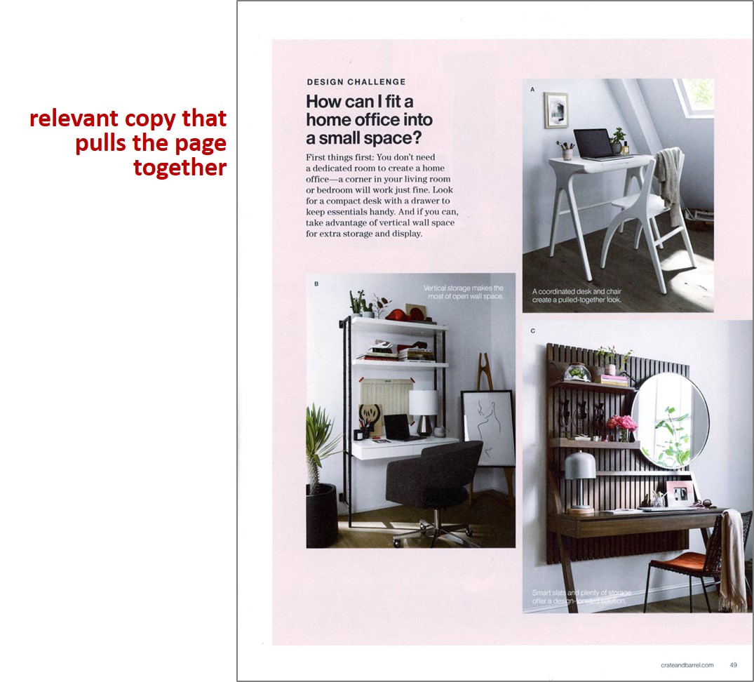
Great copy also helps pull a product grouping together, creating relevance while solving a problem. In the example above, you immediately understand why these products exist. Can you imagine the relevance for millions of people having to create a home office without having dedicated space? Solution provided.
3) Driving Engagement.
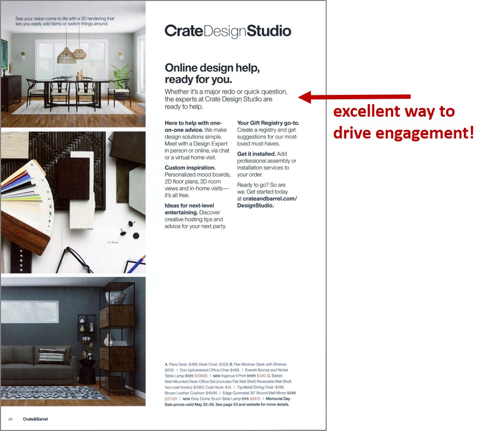
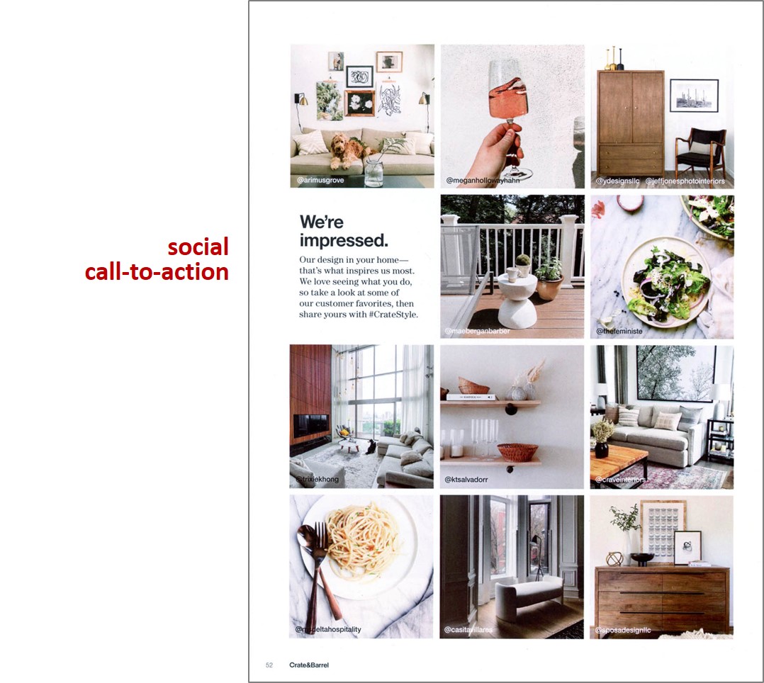
Let’s agree on one thing. A catalog’s primary role is to either encourage online or retail store engagement. Never before has the call-to-action been more important and Crate and Barrel works hard at encouraging the next step to customer engagement. On every spread I see a call-to-action, inviting you to engage in a variety of ways, from inviting customers to join the rewards program, reasons to download their app, share their products on Instagram to inviting you to use their design studio services. They invite you to go online to see more styles and choices, and they work hard at taking it to the next level.
THREE THINGS CRATE & BARREL COULD DO BETTER
1) Please Tell Me More!
Never, ever assume your customer knows what you do. Sometimes, creative teams get so close to a product or concept, they forget the customer is truly an outsider. For instance, Crate and Barrel created an entire spread celebrating a design collaboration with a designer named Leanne Ford. I have no idea who this lady is. I made the assumption that she was a high-end New York designer but not being sure, I went on the website to learn more. Nothing there –more assumptions were made. So, I googled her name and learned she’s an HGTV star; one that I’ve never seen. Her name meant nothing to me. So please, Crate and Barrel, give us a little hint of who she is so credibility is established without the hunt.
The back cover left me wanting more as well. It lacked engaging copy, the offer was tiny and the image was cropped so tight that it left me un-inspired. Worse yet, I couldn’t read the product copy … at all. Copy overprinted on imagery barely works.
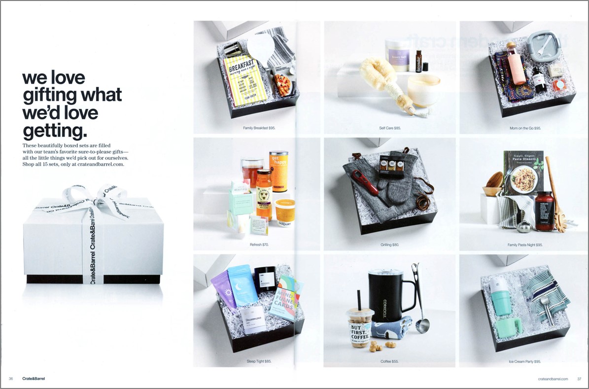
Here’s one more example with the spread shown above. Grids are a wonderful way to present products with an over-arching theme. In this case it was about gifting. Great idea! However, when gifting, people want to KNOW what they are giving. In almost every case, the photography does not support the price-points and without any description whatsoever, I’m quite sure potential sales were lost.
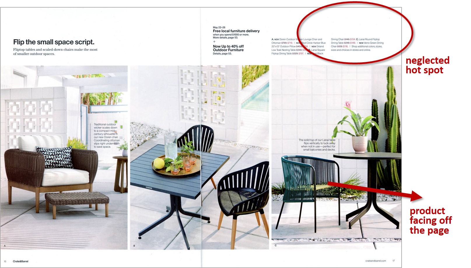
2) Take Advantage of Design Physics.
The overall catalog is a clean presentation and for the most part, well-designed. But many times the proven rules of eye-flow physics are disregarded. The two most egregious are, 1. Not taking advantage of the upper, right-hand corner (where the eye goes first) and, 2. Positioning imagery so that it faces off the page. The goal of catalog design is to build “linger time”, subtly pulling the eye into the spread. As you can see from the spread below both rules are being violated. I personally counted over 1/3 of the spreads placing either white space or tiny copy in this valuable space.
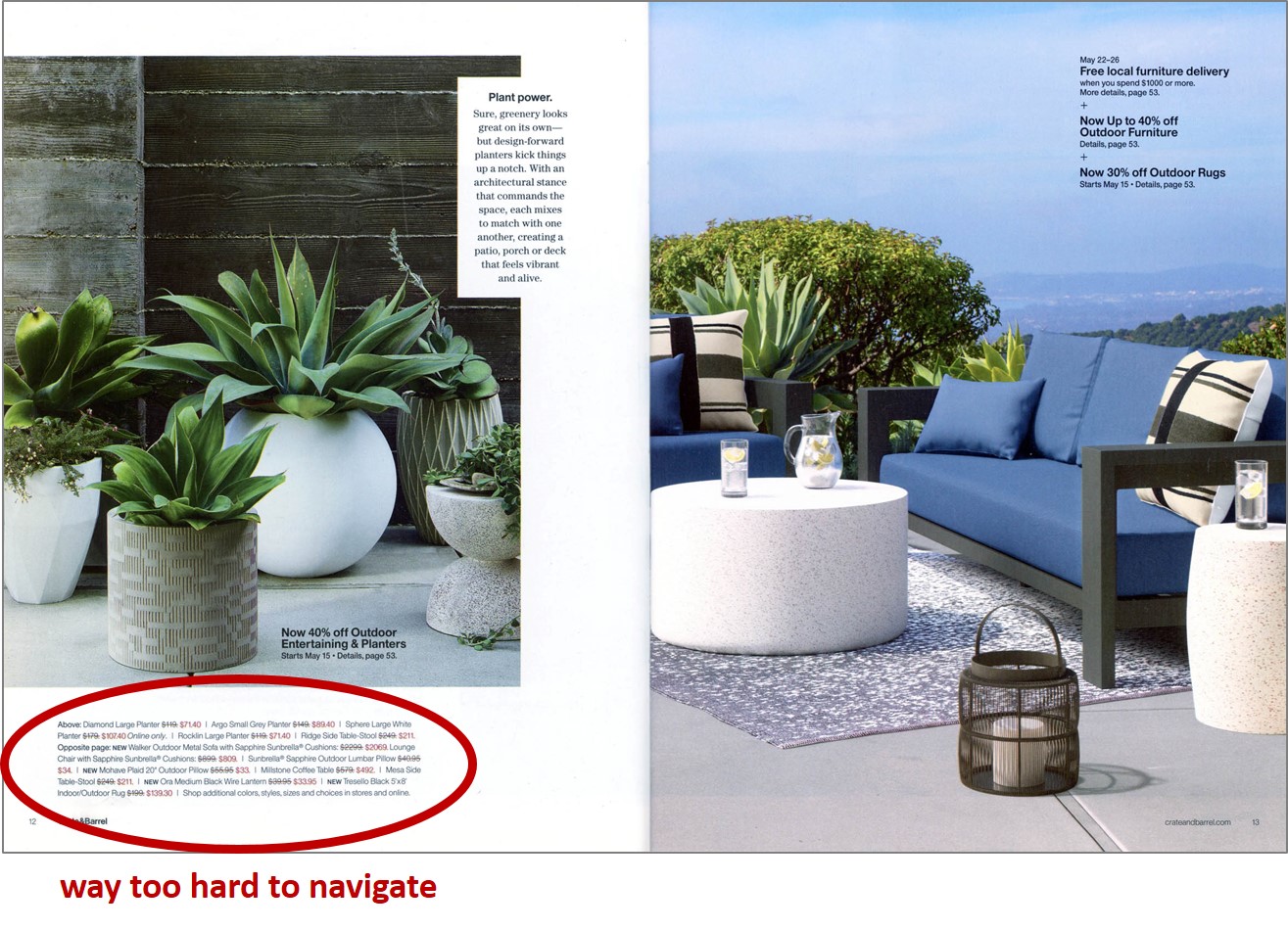
3) I Give Up.
The best photography and copy in the world will fail if you force your customer into working too hard to give you money. People crave simplicity. They insist on an easy process and don’t have time for “the hunt.” And this is exactly what this catalog forces customers to do. In my testing experience, group shots typically do not work unless you’ve clearly created a simple association between the image and the information needed to make a decision. Catalog physics tell us that customers look at the image first and if they like what they see, the next step is to find details and price-points. Crate and Barrel makes it extremely difficult to do this, by not including directional keys to assist in the customer experience. Even worse, they combine all information for all products in paragraph form, placed in tiny mice-type. Personally, I found several products I was interested in and I simply didn’t want to take the time and effort to tease out the details. The following spreads demonstrate how hard one must work to shop this catalog.
Yes, Crate and Barrel, there are so many things I love about your catalog. Your products, photography and copy are truly a delight. But please show me some love in return and create an easier shopping experience.
With every catalog our team creates, we always feel there is room for improvement and we can move the needle. How about your catalog? Would you like our help in moving the needle? Say yes and contact me at loisb@jschmid.com
Read More Catalog Critiques:


Tags: catalog, catalog creative, catalog critiques, catalog design, Crate & Barrel, Lois Brayfield