
Disruptive Catalogs: Part 2

PROVEN FACT! Your catalog cover is the number one creative opportunity to test and increase response. Why? It’s a “first impression” and your best opportunity to inspire action. First impressions are formed in a matter of seconds and if you greet your customers (or even worse, your prospects) with “bleh” your hard work is trashed. Literally. It’s milquetoast.
Merriam-Webster defines “milquetoast” as “a timid, meek, or unassertive person,” the implication being that a “milquetoast” person (or brand) is afraid to take a risk with fear of backlash. And that my friends, is the problem with most catalogs today. Brands aren’t taking risks and therefore, are not standing out in the mail.
Learn how to make an impact
Ready to take a risk? The following are three guaranteed ways to create impactful covers. But first, let me state right up front that everything mentioned below goes for your back covers as well. You truly don’t know which cover they will see first so get risk-hungry when planning both!
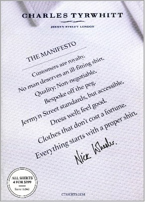
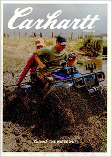
- BE BOLD
Think your covers are bold? Think again and get a little bolder. Now clearly whatever you test must be on-brand with a sensitivity to your audience. But, in most cases, consumers are delighted with anything unexpected. With close to 10,000 messages bombarding them a day, the unexpected is a tickle to the brain and a welcome relief.
There are a multitude of ways to be bold. Bold colors; think ice blue at Christmas rather than trite red. Or even a lot of negative space (think white). What about cropping your photography a little tighter or tilting it at a sharp angle? How about a bold headline or a cover with copy only? Or, zooming in on an important detail with a little selective focus to add drama? It’s all about greeting them with the unexpected.
Here are a few of our favorite BOLD covers.

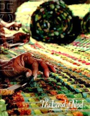
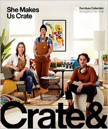
- 2. EVOKE EMOTION
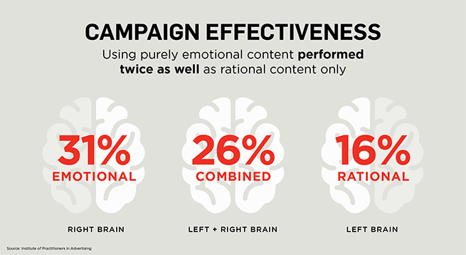
In a nutshell, emotional marketing works. Need proof? According to the Institute of Practitioners in Advertising, emotional content performs twice as well as ads with rational content only. Wait, what? Yes, TWICE as much.
What does it mean to evoke emotion? Emotions are descriptive of a state of mind with the big four being happiness, sadness, anger or fear. But emotions really exist on a spectrum and one tiny change can lead to a different kind of happy or sad. What state of mind should your brand evoke? A sense of adventure, compassion, comfort, concern, empowerment, accomplishment? The list is endless.
Once you understand the emotion you are trying to create and realize the sensitivity of your audience there are so many ways to evoke emotion. Here are just a few:
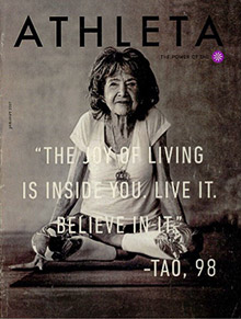
- Aspirational covers are an incredibly powerful way to inspire because they tap into a dream, goal, or vision your audience longs to reach.
- Start a movement. To feel like one belongs to something bigger than themselves is a strong emotion successfully employed by brands like Tom’s Shoes or Athleta. Both authentically tap into something they believe in that is more than just a product. They offer their customers not only a sense of belonging, but of hope.
- Color has the powerful ability to trigger emotion. Studies have shown that red translates as energy, passion (even love), while yellow creates joy and happiness. Green represents growth, harmony and freshness. Have you noticed how black and white imagery creates almost a place in time? Don’t use color as an afterthought on your covers.
- Mirror Neurons. These are a cluster of cells in our brains that mimic in your mind an experience you see, hear, or read. If you see a picture of someone participating in an activity you would like to experience, the brain virtually puts you in that situation. So, if you are selling workout apparel, show a dramatic shot of someone really working out in your products. The more authentic, the better.
A few favorite emotion-evoking covers:
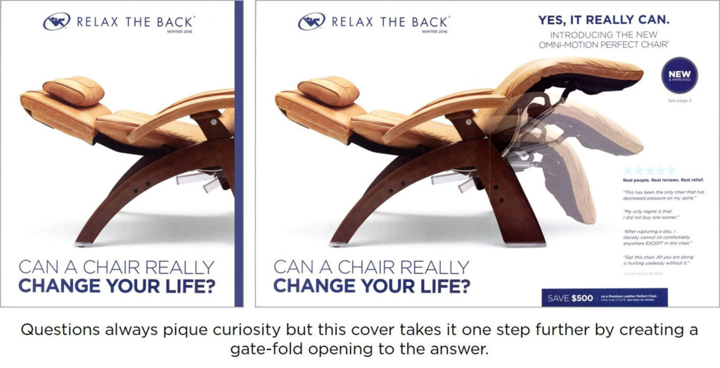
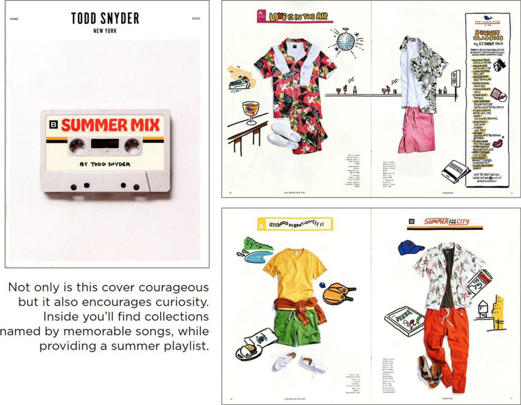
Once your catalog cover grabs attention then it’s critical you pique enough curiosity to get the reader inside. There are many clever ways to do this, but think about your cover as a question asked and the inside as an answer delivered. What are your customers most interested in? New products, inspiration, a solution to a problem? Your brand story? Tell them what they’ll find and even better, tell them where to find it. This can be accomplished with both visuals and directive copy.
I really like using this technique on back covers, visually telling them what they’ll find inside (think 2-3 categories) using short, emotive selling copy and then directing them to specific pages.
A few examples of piquing curiosity.
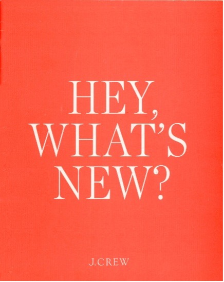
Want to pique curiosity? Ask a question with the promise of an answer inside. This is a great technique for getting customers to open your book.
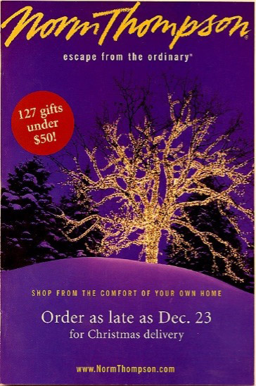
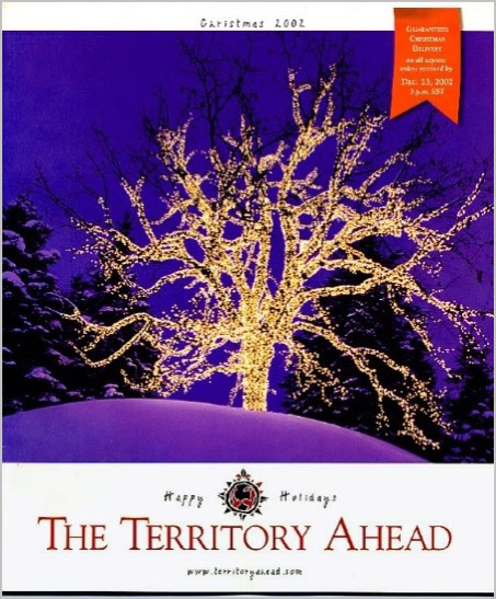
JUST FOR FUN. A HISTORICAL GAFFE.
The year was 2002 and the following two catalogs arrived in my mail on the same day. The lesson? Be careful when using stock photography as you will lose all authenticity.
Once again, if catalog covers are proven to increase response more than any other page in your catalog, doesn’t it pay to take a risk? I couldn’t coin it better than this industry icon.
“Whenever you see a successful business, someone once made a courageous decision.”
—Peter Drucker
If you are thinking about taking your catalog covers to the next level, consider letting our team help. We have tested hundreds of covers and know the risks that are worth taking. Give us a call!
Tags: Brand Storytelling, catalog design, Lois Brayfield, Strategy