
Part 4: The Physics of Creative

What if I told you it’s possible to increase response by 5% or more? Sometimes returning to the proven foundations of effective catalog design can make that happen. Yes, the role of the catalog has changed over the last 10 years – dramatically. But what hasn’t changed is the basic human physics of how we process information. Let’s revisit the tried, true and tested techniques that every creative team should know. We guarantee that when you sharpen your creative skills, you’re better positioned for breakthrough results.
As you review each of these “rules”, keep in mind that individually they may seem trivial but collectively, they can make a huge difference to your bottom line.
Your catalog physics checklist:
HOTSPOTS: Know what they are and how to maximize them.
- Front and back covers. It’s what your audience sees first and the more dramatic and disruptive, the better! The cover’s primary goal is to disrupt, quickly tell who you are, and most importantly, do everything it can to drive them inside. Driving shoppers inside means using compelling offers, the promise of incredible or innovative products, inside page references or the hint of something special. If you can’t achieve this, response drops dramatically. The images and words you use on these two pages are the most important in your entire catalog – so plan strategically to get it right!
- Front inside spreads and back inside spreads. I’m still surprised by how few catalogs take advantage of these important pages. Would it change what you present knowing that 50% of your reader’s attention will be spent on this real estate? These are the pages where you must showcase bestsellers and announce new and exciting products that share attributes with a bestseller. The opening spread is where you should tell your story, entertain and engage with a campaign and then drive a conversation. This space is where prospects go to learn who you are and what you offer. A favorite technique we’ve used in this space is what we call a visual table-of-contents; one that teases your best categories using images of products.
But don’t neglect the inside back spread, this is a great spot to repeat offers, reinforce brand position and again, showcase bestsellers. Roughly 50% of readers start from the back of the catalog, fanning the pages, and 75% of those folks are men! It’s important to consider, especially if your primary targets have a Y chromosome. - Honorable mentions. If your book is large enough to fall open where your center stitch is located, the center spread is considered another hotspot. In addition, pages that have been disrupted by an insert or bind-in will cause readers to linger longer. Use these pages wisely to present other bestsellers, product stories or other content that will delight the reader.
We have successfully tested the introduction of a new category using a “pull-out” mini catalog in the center of a catalog. This technique not only successfully launches new categories but grabs attention and more than pays for itself.
EYE FLOW – Be cognizant of how the eye wants to naturally travel.
This is important: The goal is not for every page to look the same, but to understand how the brain naturally wants to process information.
It doesn’t matter if your customers start at the beginning or read from the back, their eyes will naturally see the upper right-hand corner first. It’s critical that you carefully choose a best-seller, an interesting visual or attention-getting copy; never white-space. The goal is to immediately interest the reader and pull them into the spread. The more spreads that are viewed the higher likelihood someone will order and you’ll increase your average order value.
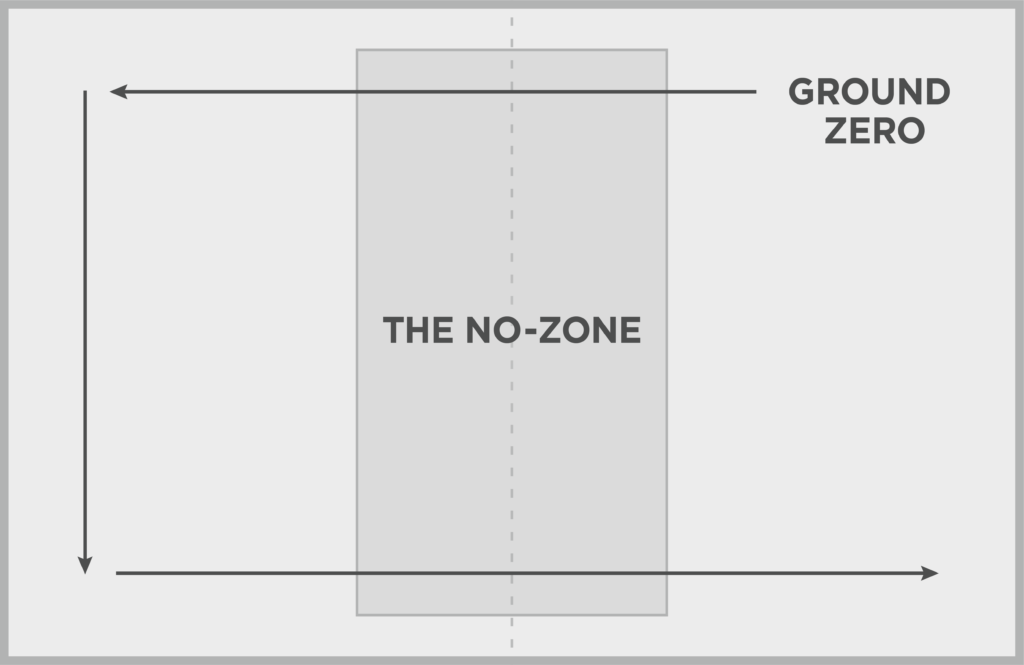
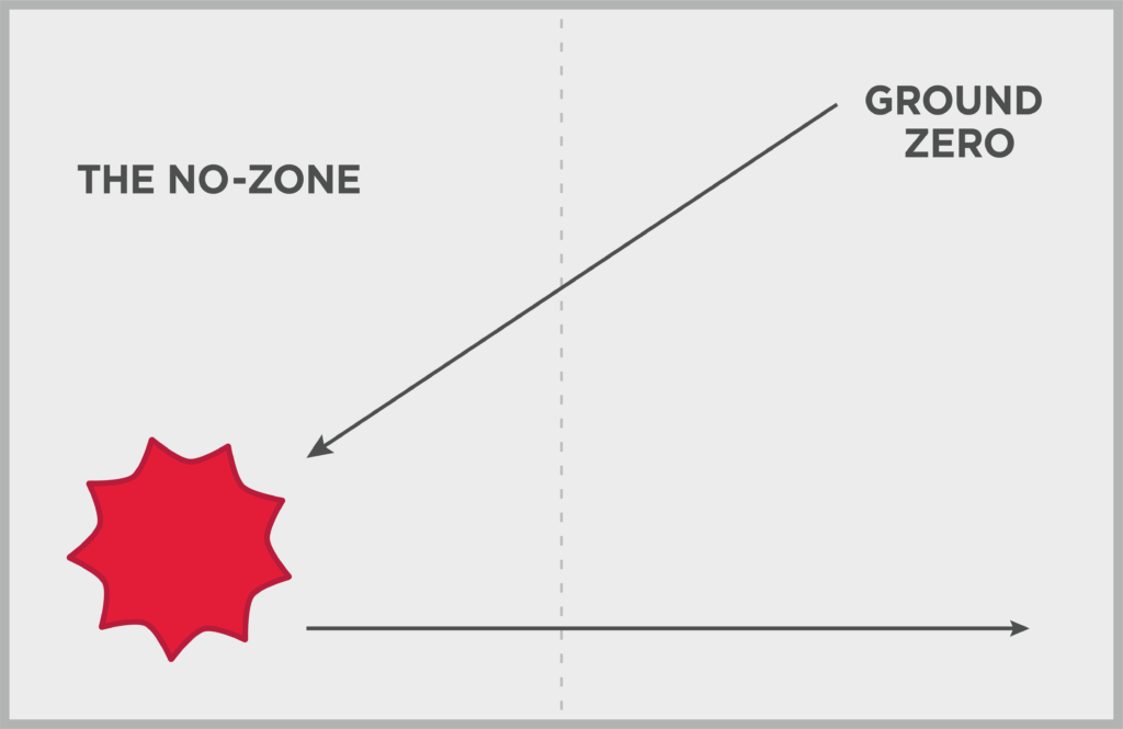
After viewing the top-right corner, the eye will naturally gravitate to the top left-hand corner, then to the bottom-left and on over to the lower-right corner, creating a sideways “U.” Note that the eye doesn’t naturally gravitate to the gutter, or middle, of the spread unless you have imagery that crosses over both spreads. If you do have one large image, consider bumping it slightly to the right so that it better pulls the eye in, or make sure that the focal point is positioned more to the right.
This is not to say that all spreads need to be designed to fit this format. Once the spread is open, you can invite the eye into other hot-spots with disruptive visuals that will tell an important story.
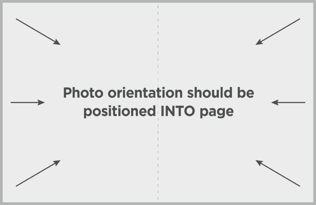
Another important trick is to lead the eye into the spread by using photos that are oriented into the spread, not off the page. This is a subtle way to keep readers on the spread longer, thus, more opportunity to delight the reader.
One final note on eye flow. As mentioned earlier, these techniques are guidelines, and they should not be used to box the designer into one-page design or you will most certainly bore the reader. Pacing the catalog with a variety of spreads will create more interest and a better chance of increasing response.
GRAPHIC HIERARCHY – Use techniques to guide and explain your story.
By using heat-mapping techniques, it’s become clear that we are drawn to certain images over others. The following are a set of guidelines that we have tested and proven to be true:
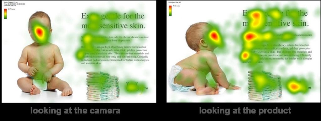
People Look at People. Over and over again, we’ve learned that the eye gravitates to people, and especially to faces. We can’t help it. And did you know that the eye will travel around the page to see what the model is looking at? Check out the example of a baby looking at the camera vs. looking at the product. Or, the same with the example of the model looking at the camera versus looking at the product. Heat-mapping exercises demonstrate how much more a product or a headline will be viewed.

Models are an important tool used to not only showcase a product but to create authenticity. Authenticity is created when the activity looks real, not posed. While models can be expensive, it’s a fantastic investment to capture an authentic pose, not something staged. Why? The more “real” looking the more something called “Mirror Neurons” kicks in and the reader literally imagines themselves interacting with the product. The sense of ownership begins to kick in!
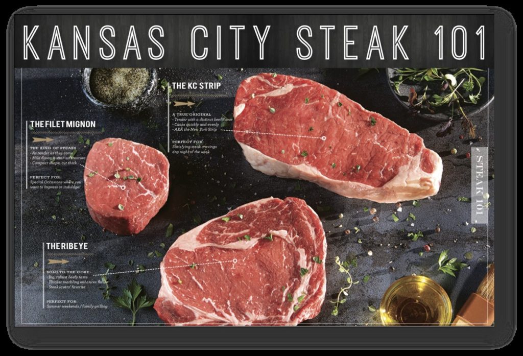
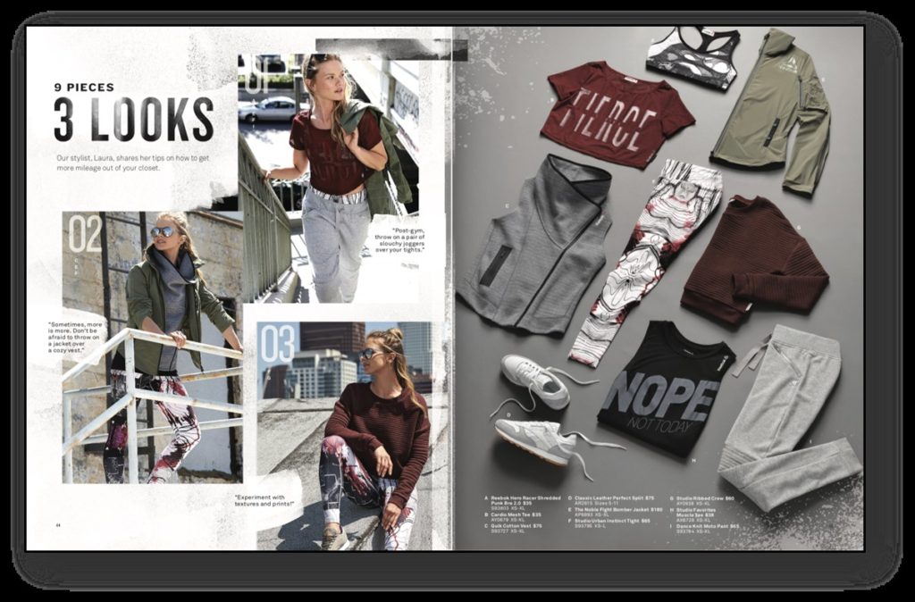
Telling Stories with Words and Pictures. Rather than just selling product, telling a product story in an interesting way will always boost response. Consider the examples below. The first example by The Kansas City Steak Company, educates the reader while the second example inspires the reader to consider more than just one product.
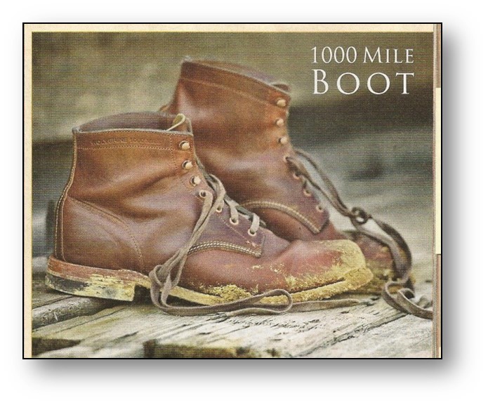
Realness is another way to tell a product story. Sometimes, a little messiness helps, as it does with this 1000-Mile Boot. The image of muddy boots with broken-in leather helps complete the storytelling that started with the copy. And to an audience who is used to seeing ads with perfectly polished products, it’s strikingly different. Finally, it’s a key choice to keep the focus on the product, rather than a busy background.
Product Presentation Hierarchy
It’s important to note that people buy things because of the way they look, what they do, or how it makes them feel. A designer and copywriter must understand the difference and do everything possible to pin-point the goal. Words and images matter!
Once on a spread, there is most certainly a hierarchy for how people process information. In order, people look at:
- The image
- A visual disrupter like a call-out, caption, inset explaining the product, etc.*
- The price-point
- The product headline
- The product copy
*Important concept: Please note that because the price-point is processed first, your product image must support the cost. If the value isn’t immediately clear, your design team must do everything possible to call out the reasons for the price-point. If you don’t do this, the reader will decide it’s not worth the price and move on. This is why it’s important to tell the “rest of the story” with call-outs, captions, in-use demonstrations, etc.
Copy Hierarchy
While a catalog or direct mail piece is certainly a visual medium, words really do matter! In fact, a few carefully chosen words can create emotion, tell a story or drive perception. Long copy typically is not read unless it’s incredibly entertaining. Headlines are generally the most important words on a spread, but in order to take full advantage, they need to be short and highly graphical.
Generally, copy is digested in this order:
- Spread headline
- Copy violators, like captions, call-outs, quotes, calls-to-action
- Price point
- Product headlines
- Price-point
- Product copy
Bottom line. A catalog designer and copywriter should be strategists discussing the goal of every page in your catalog. This is not a design exercise but an opportunity to DISRUPT, DELIGHT and DRIVE engagement. When Aristotle said that “The whole is greater than the sum of its parts,” he certainly wasn’t talking about catalogs. But when it comes to catalog design and copy, it’s true!
Interested in improving your response with creative? Consider our Free Creative Assessment or our Creative Refresh. Or, contact me at loisb@jschmid.com.
Tags: catalog design, catalog physics, creative, creative deesign, creative research, Creative Strategy, Design Hierarchy, Knowledge-Based Creative, Lois Brayfield