
Paper Source: From The Page To The Screen

Paper Source is known as the premier option for all things stationery, wrapping paper and seasonal goods. A step inside one of their stores is a celebration of all things creative and tactile. And as paper-lovers ourselves, you know that we here at J.Schmid appreciate a quality printed page.
In a deviation from their normal goods, however, they’ve produced a quality, online-only catalog that celebrates both their everyday offerings and their seasonal gifts and décor as well. This online option takes a whole new approach to the three most important goals any catalog should have: to DISRUPT, to DELIGHT, and to DRIVE.
Paper Source takes advantage of the digital nature of their online catalog with animated graphics and eye-catching colors that disrupt the customer’s reading experience. They combine clean, white pages with their trademark splashes of bright design and color to delight. And perhaps most importantly, they utilize clickable links and calls-to-actions in order to drive each and every potential customer to their website.
They have a great model for success, but it would be beneficial to examine the book even further – at those places where they’re doing well, and where they could stand to improve. Let’s take a look.
Three Things Paper Source Does Well
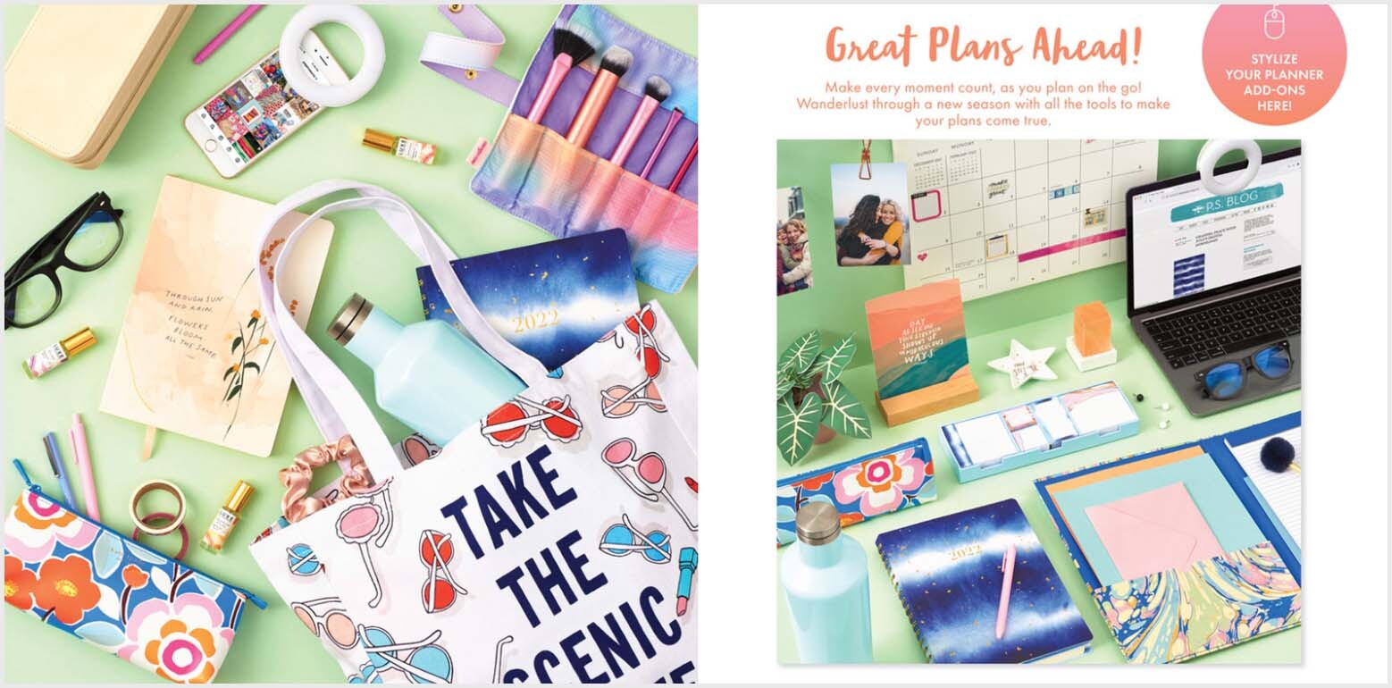
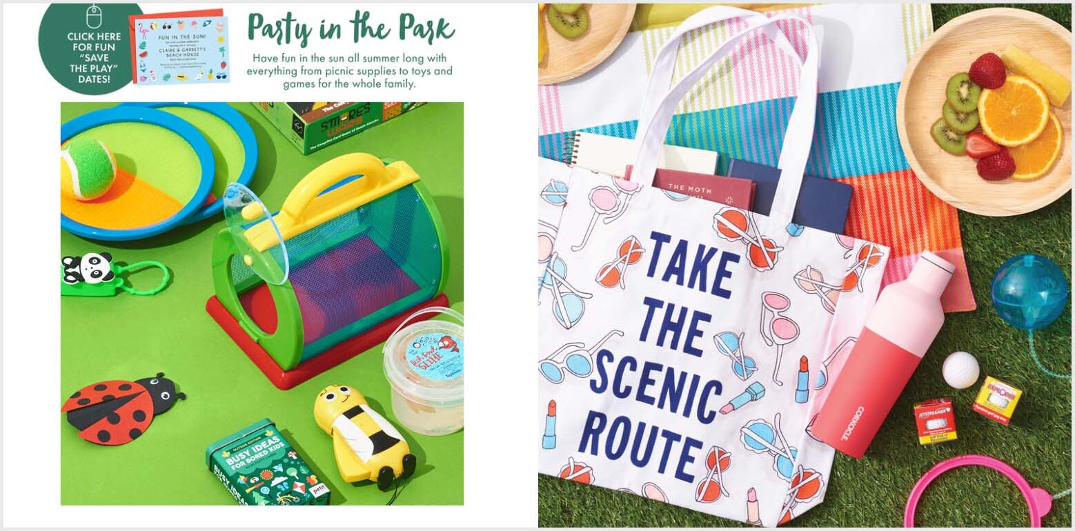
1) Products are Shown in Action
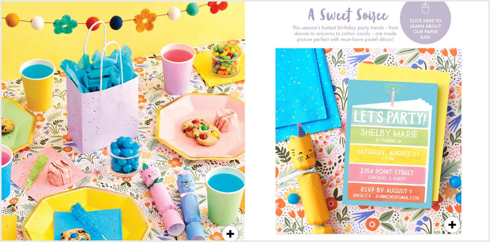
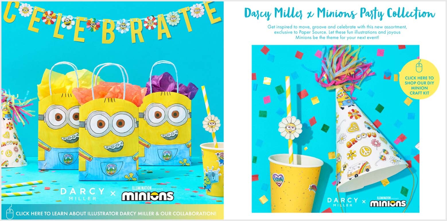
While many companies default to static grids of products and SKUs, Paper Source clearly shows each and every product in action. Their colorful, creative laydown photography gives the impression that you’re getting a glimpse of the room right before the guests arrive. This offers a psychological advantage to any shopper wanting to throw a similar soiree themselves. They don’t have to use much imagination, because their dream party set-up is already pictured!
2) They’ve Organized the Chaos
The first thing that struck me about this catalog is that it is jam-packed with color, texture and design. There’s a lot of movement taking place – not only from the animated graphics they’ve added, but from the strategically cluttered desks and carefully distributed confetti. In addition, they’ve managed to include an extremely diverse variety of product in the book. To organize it all in a cohesive and comprehensible manner would certainly be a challenge, but I think they’ve done a good job. Every time you turn the page, you clearly understand what sort of products are being presented on that particular spread, and you understand that there’s been a shift from the last spread you looked at. For example – The ‘Sweet Soiree’ spread and the ‘Minions Party Collection’ spreads are each illustrating some sort of children’s party. But the color scheme of each page makes it perfectly obvious that the two parties are separate from one another.
3) Constantly Calling to Action
They’ve done a really excellent job of utilizing the advantages of this digital catalog. While every book should include calls to action on every page, Paper Source has turned those CTAs into clickable links that lead them to more specific places on the website. Even pages without a dot whack feature a small ‘+’ icon in the bottom corner, which will lead them to ‘more info’ when clicked. My only suggestion? The words ‘More Info’ should be even more visible than they currently are. If they replace that ‘+’ icon with the words themselves, the CTA will be much more intuitive.
Three Ways Paper Source Could Improve
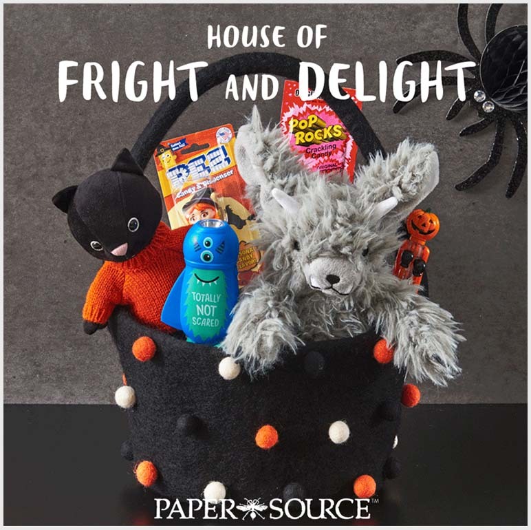
1) Front Cover = Major Cliff Hanger
The first paper cut I have with Paper Source is concerning the relationship between the Front Cover and the rest of the book. While the Front Cover is laid out nicely and offers an intriguing look into their Halloween product, it is completely unrelated to anything else you’ll find in the following spreads. Halloween is never mentioned again, and anyone who opened to that first page with the hope of finding more ‘Fright and Delight’ material is left hanging. They could improve this problem by considering both the Front Cover and the 2/3 spread to be an all-inclusive story.
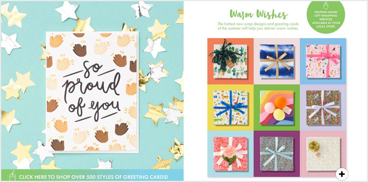
The 2/3 spread would be the ideal place to mention all their holiday greeting cards and other products, but no mention is made of these offerings anywhere in the book. To make the catalog relevant, they need to continue to rotate their product through its pages and include at least a holiday spread or two. And when they open to that first page, customers should be able to count on some sort of payoff from whatever was advertised on the Front Cover.
2) Give the Eyes A Rest
As mentioned above, Paper Source does a good job of managing all the chaotic color and imagery happening in the book. However, I do think they could have helped themselves even further. By varying the layouts a bit more than they currently do, they could introduce a greater amount of white space and, put simply, make each page a bit easier on the eyes. You’ve heard it a million times, but it’s worth saying again: Less. Is. More.
With the space they do have, I also wish they’d used some of it a bit more productively They don’t include any offers throughout the catalog, though there are plenty mentioned on their website. Whether print or digital, offers matter and make a big difference.
3) Invite A Few Guests Next Time
Each spread has such an inviting setup, it’s a shame they didn’t invite any guests! Including people in catalog photography has been shown to attract much more attention and keep readers more engaged throughout their experience. Including even arms and hands could make a huge difference and take this catalog from good to great.
The catalog is also extremely difficult to find on the website. The only way I was able to locate it was via the search bar, so it makes me question how productive it actually is for Paper Source from a sales perspective. They should invite guests to be in the book, and also invite guests to come take a look at it.

Paper Source has done a great job putting their catalog together, but even the best books can be improved. Their brand is a powerful and creative one! It deserves to be represented in the highest-quality way possible.
Read More Catalog Critiques:


Tags: branding, catalog design, Customer Experience, Strategy