

Receiving the Amazon catalog in the mail seemed like an industry event. The biggest online retailer in the world mailing a catalog? For many of us that grew up in the catalog world, we felt vindicated; print is powerful.
But with all the muscle in the world, how do you think their catalog stacked up? Did they take advantage of the power of this media or did they miss the mark? Is there anything we can learn from their efforts? Let’s dig in and see …
Before digging into the good, bad and ugly, let’s begin with the FANTASTIC! Aside from the fact that they “showed up,” the Amazon catalog took a great leap in shortening the path to purchase.
We all know that a catalog is not a transactional tool, but a powerful driver to the digital store. But many catalogs fall short, neglecting the tactics or powerful calls-to-action to create immediacy. Amazon, the King of Easy, stayed true to form and developed a super easy, shorter path to purchase. How? The consumer can use their mobile device to scan a product, which uses image recognition to load it on their screen, ready to move into their shopping cart in the Amazon app. Wow! Kudos to the team at Amazon!
With new advances in technology and print, what is your team doing to explore ways to create an easier customer experience? Allowing the customer to scan printed content getting them quicker to “yes” is an absolute game-changer when it comes to integrating print into the mobile shopping experience.
The Good
By calling their catalog the “Holiday Wish Book,” geared towards children, Amazon immediately creates an emotional connection for both adults and children. For parents, it’s an emotional link to their childhood and, if they are old enough, the Sears Wish Book. But it’s also a practical connection prompting their children to create their holiday list. For children, how much fun is it to pour through 90+ pages of toys and dream of what could be?
Amazon took it one step further to engage children adding games, stickers, craft activities and even space to create their wish list, all sprinkled throughout the catalog. Research tells us that the longer one spends with a catalog, the higher the response and average order. By adding the fun activities, this catalog is sure to have a longer lifespan, designed to get passed from parent to child and back again throughout the key holiday shopping weeks.
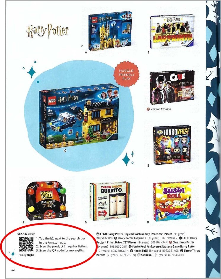
Dozens of call-to-actions paired with a QR code throughout the catalog earn another checkmark on the good list. For almost every spread (i.e. Hot Wheels, dolls, gaming, etc.) a shopper can use the QR code to find more in that category. My only criticism is that the copy next to these codes is tiny and hard to read. But Amazon understands the value of engagement which few catalog brands execute on this level.
And finally, the product assortment found inside includes a wide variety of toys, games and apparel appealing to all ages and genders. In most cases, the products are themed on the spread which helps children see options in a category they love. I have to think that with Amazon’s incredible data knowledge, they can serve up the best of the best in terms of customer demand.
The Bad
While this is a catalog geared towards children, parents play the ultimate role in the purchase decision. We know from testing that excluding pricing in a catalog can be the kiss of death. That’s right, there isn’t a single price-point anywhere in the catalog. I’m sure this is because Amazon plays in the dynamic pricing world and pinning down a universal price would be next to impossible. Yes, this is considered “bad” but by creating the scan-able product on the printed page, they slightly redeem this roadblock.
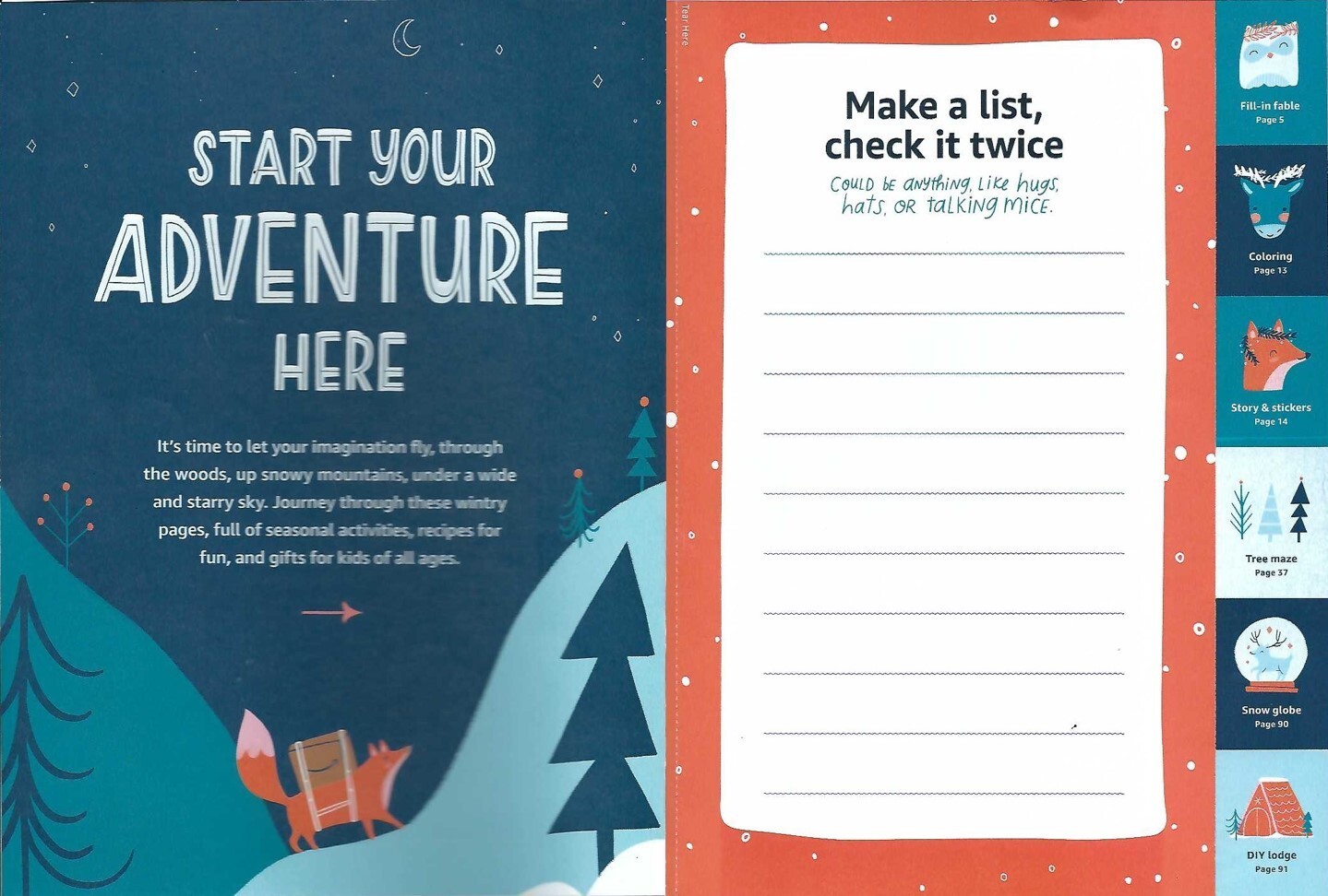
It’s common knowledge that the prime real estate in a catalog is the first several opening spreads. It’s important to immediately represent products or categories that best reflect what they’ll find inside. In fact, many tests indicate that you must begin selling on the first or second spread or you may lose the reader. Amazon doesn’t begin to sell products until the fourth spread in. To make matters worse, the table of contents found on the second spread only directs you to activities, not categories of products. The first three spreads are a confusion of graphics, inserts, a recipe and an activity. On the third spread, they buried some of the most important information that outlines the benefits of shopping with Amazon. Some of this information is so important that it should be mentioned throughout the catalog, not just once. More about this under the Ugly section below.
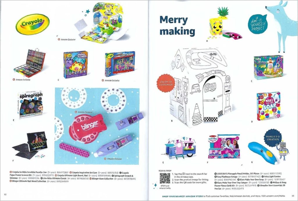
Visually, this catalog is too “democratic” and ultimately monotonous. Every spread looks the same, with most products presented the same size in a grid-like fashion. There aren’t many spreads that grab attention graphically or create visual show-stoppers that cause the reader to pause. One should never assume that the consumer will look at every page; they must carefully guide the reader through the catalog by creating visual breaks, taking advantage of page hot spots and promoting hero products. Many of the products are presented facing off the spread, rather than into the spread which again, pulls the reader in. This catalog didn’t use any of these techniques. It’s just boring.
Product pictures are often small, and sometimes only presents the packaging, making it difficult to understand what is being sold. To make matters worse, product copy is difficult to find, hard to read and of little value. Yes, there are keys to help you find the product copy but once there, all content from all products found on that page is merged into a single paragraph – impossible to navigate! Amazon missed a wonderful opportunity to use product call-outs exploiting the key benefits of a product. At the very least, they could have included the product name allowing one to search online for the product.
The Ugly

Yes, the cover is appealing and inviting. What’s ugly here is the missed opportunities! Most brands that mail a catalog have learned that the two most important, response-generating pages within a catalog are the front and back covers. Why? It’s what consumers see first and the number one role of these pages is to quickly tell who you are, what you are selling, present offers and get the reader inside. I would give the Amazon catalog an F on all counts.
- The catalog is called “Joy Delivered” with the name Amazon a small-type mention on the front cover. With Amazon’s name recognition, this is a crime. I will offer a small pass since the illustration included their logo on boxes. Regardless, if I hadn’t seen the Amazon logo on the back cover, I might have tossed this into the bin.
- No mention of any offers, including Prime Delivery.
- While there are toys placed on the back cover there are absolutely no inside page references attached to each product or for that matter any copy that encourages me to go inside. None. In fact, there isn’t a single mention of any of the activity pages.
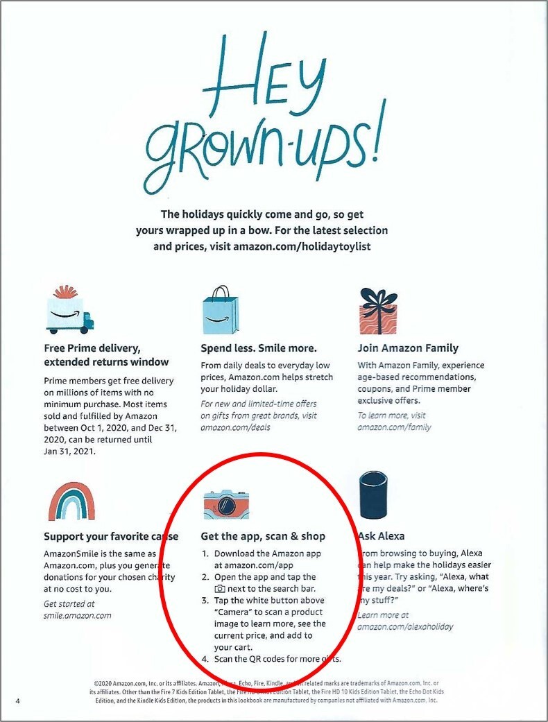
And now for the biggest crime of all. Earlier I mentioned the FANTASTIC mobile user experience Amazon offers, allowing the consumer to scan every product while using the Amazon app. Unfortunately, Amazon blew it by only telling the consumer about this incredible tool once. That’s right … once. In fact, it was buried on page four using an icon of a camera, not even a mobile phone! Given that they’re not including pricing or product names, presumably they’re relying on the image recognition and the app to provide this info. So it’s imperative that catalog shoppers know it’s there, which means you need to tell them more than once. If I hadn’t been digging deep into this catalog, I would most certainly have missed this benefit. What a wasted opportunity! This should have been exploited throughout the catalog if not every spread.
So, there you have it. The biggest retail giant in America, while at least showed up, they missed some big opportunities here. Rather than gloat, instead review your catalog and ask if it is doing everything it can to create a better shopping experience.
Interested in having your catalog reviewed by our team? Give me a shout at loisb@jschmid.com.
Tags: Amazon, Amazon catalog, catalog design, creative, Creative Strategy, Lois Brayfield, Strategy