
ROKA

At J.Schmid, we know catalogs. But we also know that in order to stay at the forefront of change and innovation you need to be a student of your craft. We’ve learned what works, what doesn’t, and where unexpected opportunities may lie. This blog series will showcase our expertise, as we take an in-depth review of well known (and lesser known) brand catalogs, uncovering triumphs and explaining mistakes, because even the best catalog can always be better.
I’ve chosen a catalog from a brand that I was unfamiliar with. This was the first time I’ve seen the ROKA catalog, so it gave me a chance to view it through a fresh, unbiased lens (pun intended). These guys sell glasses. But not just any glasses. They design and make performance eyewear for athletes. Interesting concept.
I’ll point out three things ROKA is doing well in their catalog, and three things they might improve upon. Hopefully these observations will help you identify strengths or weaknesses in your own book.
When creating compelling and effective catalogs for our own clients, we always use the filter of “Disrupt. Delight. Drive.” First, is the catalog (specifically the cover) disruptive? Does it stand out and get noticed? Second, does it contain content that delights the reader? Do you tell your brand story in an interesting and compelling way? And third, does it drive people to action? Do you give them a reason to act?
On top of those three key ingredients, I always add the important question, “does the brand feel HUMAN?” In addition to selling something, does it make people feel something? The best brands—and catalogs—always do.
Three things ROKA is doing well:
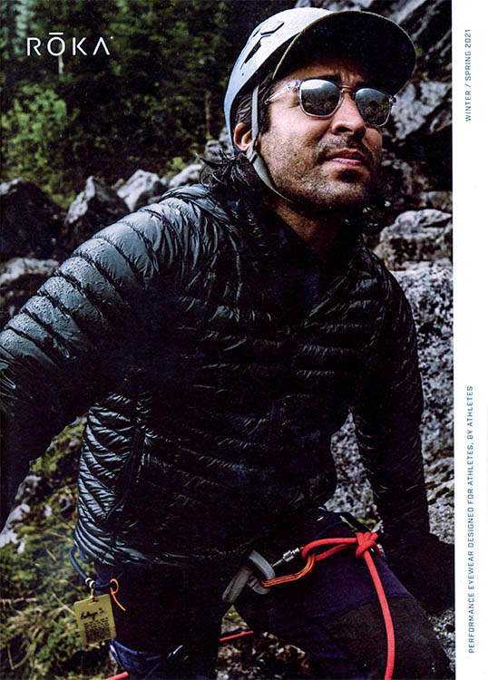
1) Keep it Simple
The front cover is simple and enticing. They’re not trying to do too much. They feature a powerful image of a guy rock climbing (being active) while wearing a cool pair of sunglasses. Simple, tasteful treatment of their logo in the upper left corner. And my favorite part…the tagline that runs up the righthand side of the page that reads “Performance Eyewear Designed for Athletes, by Athletes.” This one sentence says it all. It clearly describes what they do, and what makes them different.
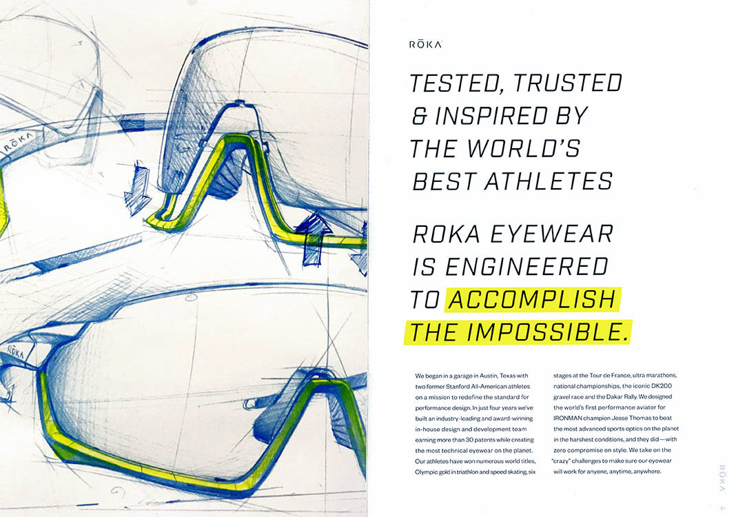
2) Tell Your Story
The opening spread is devoted to telling their story. An eye-catching headline makes you want to stop and read. And then when you get into the body copy, you quickly discover their unique story. “We began in a garage in Austin, Texas with two former Stanford All-American athletes on a mission to redefine the standard for performance design.” Who doesn’t love a good underdog story about a business that was started in a garage? (Apple, anyone?). Once upon a time, this valuable real estate on the opening spread would be completely devoted to selling product. Maybe it would include a table of contents and a letter from the president. Those days are gone. Now, people want to know who they’re buying from. They want to know what your company believes in. They want to know your story. This first spread is the perfect place to communicate those things. People want it. In fact, they expect it.
3) Function Comes First
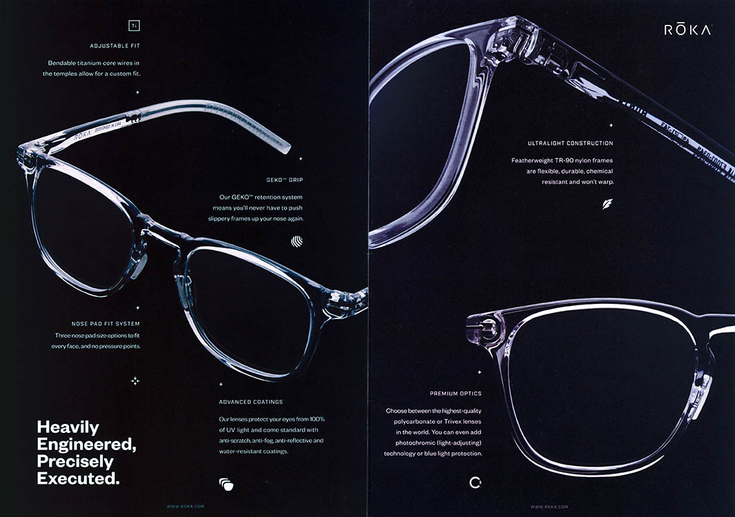
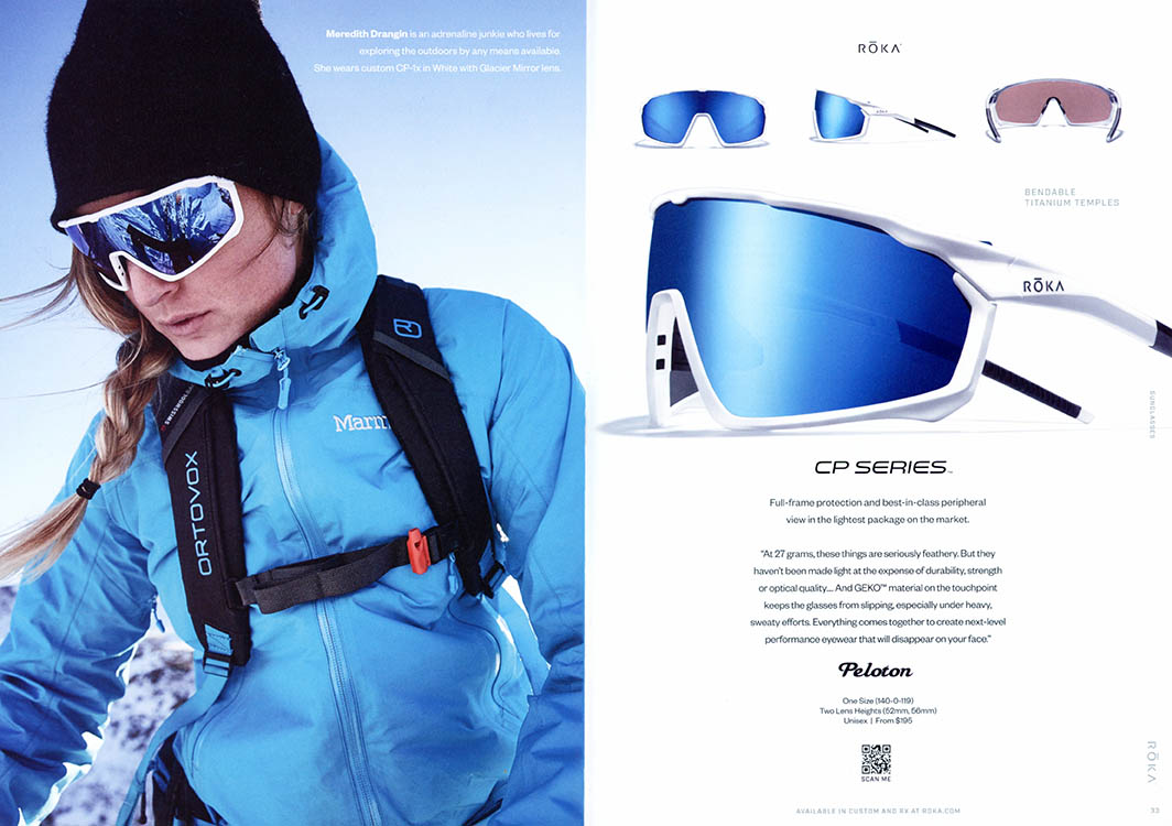
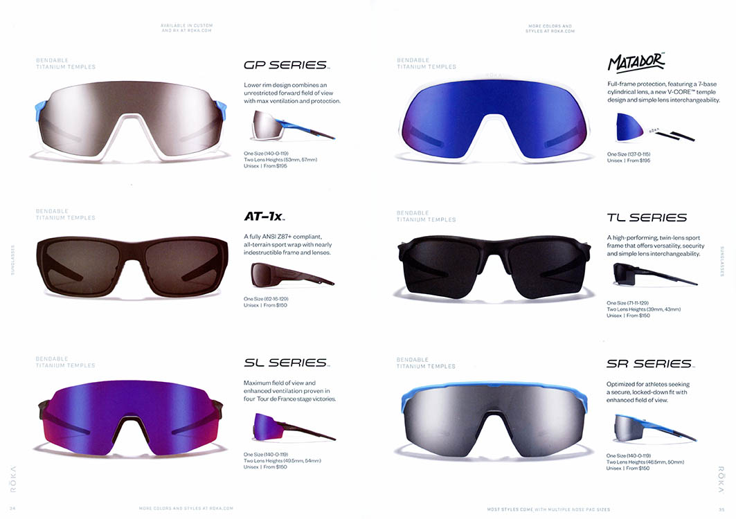
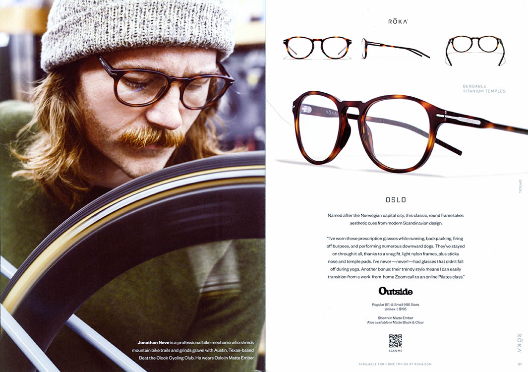
I love how ROKA has made the process of flipping through their catalog a delightful experience by adding variety. Each spread feels different. They mix lifestyle images of real people (explaining who they are in call-out copy) with simple, easy-to-shop silhouetted images of their glasses. Some spreads have large, show-stopping ‘hero’ images and other spreads are dense with grids of product. They make boring technical information exciting by listing features and benefits next to artful images of their glasses on a black background, making them stand out from the other pages in the book. And maybe my favorite thing is how they feature real athletes (not models) wearing their glasses in real scenarios. They understand this is not merely a fashion choice—it’s a functional choice first. These are glasses for athletes looking for a stylish solution that won’t fall off and won’t break during intense activity. And they tell that story over and over again with striking images and interesting copy.
This is a fun book to shop. It holds your interest and informs at the same time. It tells their brand story and sells product simultaneously. This is one you don’t want to throw away. You might even pass it on to a friend. Which is the goal, right? There are many other things this book does well, but in the interest of time, I need to move on to the missed opportunities.
Three things ROKA could do better:
1) Fully Utilize Both Covers
Simply glancing at the front or back covers, you may not realize right away that they sell glasses. Are they in the outdoor apparel business? Do they sell puffer jackets? Maybe a closer crop or an inset of a silhouetted image of glasses overlapping the lifestyle photo might help. Also, they feature only sunglasses on both the front and back covers. No visual reference of regular glasses. I would suggest showing a variety of frames on the back cover to show the range of styles you’ll find inside. And an inside page reference number that tells the reader where they can find that particular frame (both front and back covers) would be helpful.
2) Drive Them to the Website
Even though ROKA frequently pushes people online throughout the book to “see more styles” or “try 4 pairs at home”, I think there is opportunity to dial up the calls-to-action even more. Since the catalog is a primary driver to push people online or to take action in some way, let’s give people a more compelling reason to act. Maybe feature online interviews with the featured athletes, or behind-the-scenes videos of the glasses being made. Give them interesting content to get them to the website.
3) Reinforce to Reassure
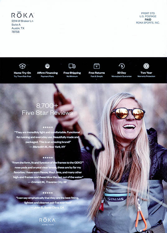
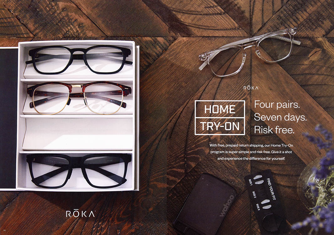
Buying glasses online is a tricky proposition, even though Warby Parker has been doing it successfully for years. I would suggest ROKA emphasize a “worry-free guarantee” throughout the catalog to help ease any concerns. They do a good job of shining the light on their risk-free home try-on program, devoting an entire spread to this message, but reinforcing it again and again throughout the book wouldn’t hurt.
And one last observation: for an eyeglass company, some of the type is fairly hard to read. They use a lot of reversed out copy, small point sizes, and centered text. All of which affects the overall readability. A few adjustments would help remedy this, without affecting the overall design.
All-in-all, this is a great book. They clearly understand how the role of the catalog has changed, and treat it as more than just a transactional device. They highlight what makes their brand and product special. They feature real people with compelling stories that make the brand feel more human and likeable. They don’t overwhelm with packed pages full of too many choices. And they give you a reason to want to go online to find out more.
Without these important things, all they’d be doing is selling glasses.
If you’d like the experts at J.Schmid to take a look at your catalog and help you create a better selling experience, give me shout at brentn@jschmid.com. We’d love to help.
Read More Catalog Critiques:


Tags: #catalogcritiques, Brent Niemuth, catalog critiques, catalog review, Humanity Marketing, ROKA