Uncommon Goods: The Friend That Knows Just What You Need

Throughout history, there have been millions of catalogs designed, printed and distributed to customers around the world. So what separates the good ones from the bad ones? Here at J. Schmid, we believe the answer to that question is actually pretty simple. Every great catalog should check three boxes:
-Disrupt (make them stop and look!)
-Delight (make them happy they did!)
-Drive (give them a reason to take the next step!)
Like a good friend, a catalog that disrupts, delights and drives knows exactly what the customer needs when they need it. It’s interested in a relationship that is mutually beneficial. It meets them where they’re at. It communicates clearly. It doesn’t complicate simple messages. And ultimately, it does everything it can to empower the customer with products that will solve some sort of problem they face (and gets bonus points for a good sense of style, too!)
Three things Uncommon Goods is doing well:
1). Keeping It Simple
The logo and overall brand of Uncommon Goods is refreshingly straightforward. The name does a great job of communicating who they are, what they value and what sort of problem they can fix for their customers. And the catalog matches that simplicity: they do just enough to keep the customer engaged, and they maintain the white space needed to create an aesthetic, clean-cut experience. The cover introduces the brand with a colorful (yet classy!) image, type treatment that prioritizes readability, and – most importantly – a call to action that will drive customers to open the book.

2). Making Headlines Active
Uncommon Goods has positioned its products as those ‘perfect-for-the-hard-to-shop-for’ gifts that everyone finds themselves searching for from time to time. For this reason, they’ve separated those gifts into categories that are clearly meant for specific people and specific occasions. Most impressive, though, is the way they kick the quality of their headlines up a notch by making them active. Each one clearly indicates the kind of gifts a reader will find within that section but also works hard to communicate a deeper layer of the benefit being offered.
Rather than a simple “Birthday Gifts” headline, they encourage you to: “Reestablish Birthday Traditions.” Instead of “Presents for Valentine’s Day,” their headline reads: “Recommit To Love.” And while ‘Something For The Dad Who Never Asks For Anything’ would have likely been an accurate description for page 4 – Uncommon Goods knows that “Celebrate Family” is a headline that’s much more in touch with the interior motivation of their customer.
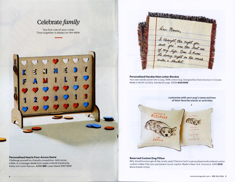
3). Finding Opportunities For Relevance
The basic purpose of a catalog is to provide options for a customer interested in making a purchase. But the best catalogs know that there’s so much more to it than that. The elevated goal is to reach the customer in a way that’s personal, relevant and distinctly unique from any other brand they might be considering. Page 52 is a great example of the decision to reach for that deeper relevance.
Rather than simply including the Minute Mimosa Sugar Cubes as just another product, they’ve included both a photo and a description of the maker herself. A personal quote transforms the cubes from a potential purchase, to a potential experience. Now, not only can mimosa-lovers find something meaningful on this page but so can any creative foodie, Arizona native or entrepreneurial woman who sees just a little bit of him or herself in the creator of this unique offering.

Three things Uncommon Goods could do better:
1). Give Them An Action Shot
Everybody loves a hero. Active, lifestyle shots are a great way to show customers how much fun the product you’re selling can actually be, and to present the hierarchy of the page in an entirely new way. In other words, you get the chance to tell your customers up-front who the main character of the story is.
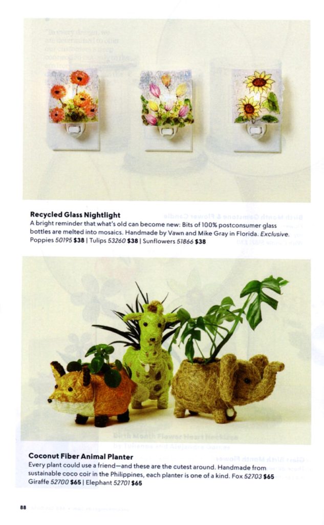
For example, the Recycled Glass Nightlight and the Coconut Fiber Animal Planter on page 88 are presented as equally important. The images are identical in size and similar in color. Had Uncommon Goods utilized a lifestyle image, they could have chosen to stage both products in a way that not only showed them in action but also directed the eyes of the reader to the product that Uncommon Goods wants to promote most.
Lifestyle shots can also incorporate models, which Uncommon Goods doesn’t typically do. While it’s not necessary to use models to showcase a brand’s products, heat-mapping studies have proven that consumers typically gravitate toward images of humans when flipping through a catalog.
In the same way, active words in the headlines can transform the customer experience, images that communicate movement and evoke emotion are an essential way to speak to the motivations that drove customers to the book in the first place.
2). Take Full Advantage of Calls To Action
Serious question: Have you ever passed a sign for a Saturday-morning garage sale, changed the course of your drive (and even turned down the radio to focus on your search!) – only to end up lost, and unable to locate that coveted driveway of secondhand treasures? Maybe it’s just my directionally-challenged self that has experienced this – but if you know what I’m talking about, you know that it’s not a pleasant start to the day. That confused and disappointed feeling is exactly what you don’t want your customers to feel when perusing your catalog, and this is one area where Uncommon Goods could improve.
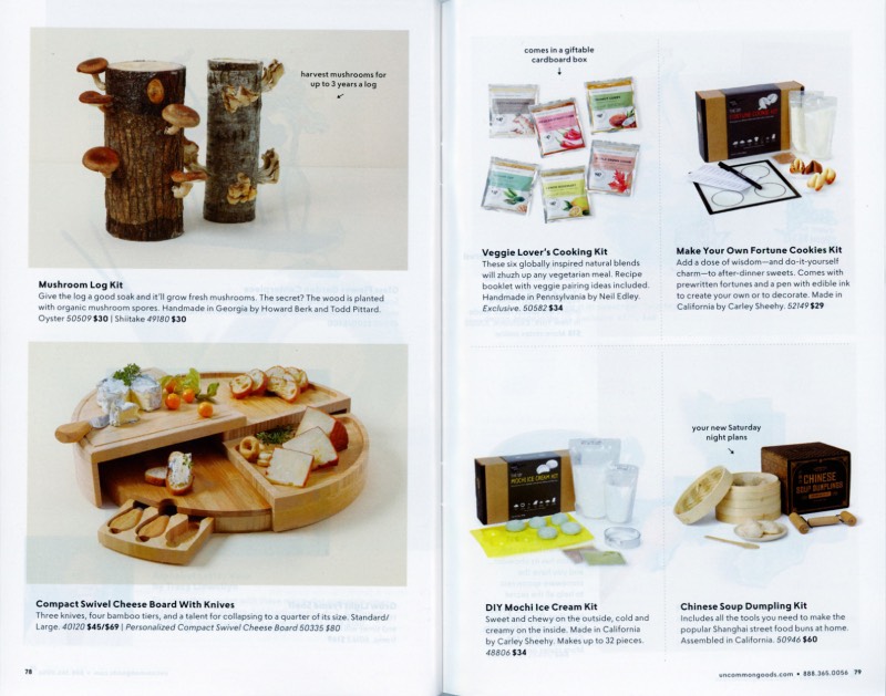
They offer products that disrupt and opportunities that delight, but most pages lack any sort of direct instruction to the website. Sure, the phone number and URL are listed at the bottom of the page – but for what? How is the customer supposed to know what they’ll find when they follow those avenues? The best way to help readers reach the proper destination is to include the catalog equivalent of a big, telephone pole-affixed sign that says, ‘Turn Here!’ That catalog equivalent is (that’s right, you guessed it!): a call to action.
Disrupting and delighting are lots of fun, but they ultimately leave your customer hanging. A call to action will help you make good on all the promises your creative makes by simply telling the reader exactly where to go next.
3). Help The Back Cover Lead
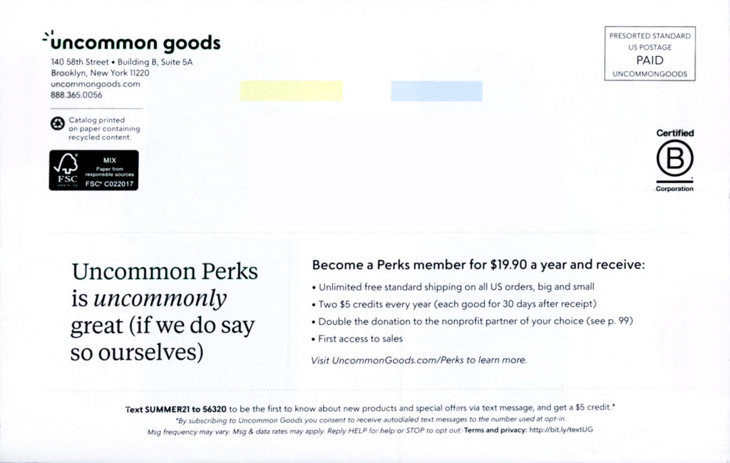
There are several ‘hot spots’ within a catalog, where eyes typically travel first. The Back Cover is most definitely one of those (just think about how many shipping labels greet you each time you open the mailbox). Uncommon Goods used their back cover to advertise their loyalty program, Uncommon Perks. This is a good choice, as it’s likely a priority for them. The opportunity for improvement, however, lies in the layout and color choices of the design.
Because the entirety of the back cover is not only copy heavy but also black and white, the brand’s messaging blends in with the shipping label. At first glance, customers will likely assume it’s information meant only for the post office and flip it right back over to the front.
By surrounding the text that currently exists with some sort of colorful box or image, they could differentiate their offer from the shipping label and help their customer find what Uncommon Goods wants them to look for.
No friend is perfect, and no catalog is either. But that’s not the point. The point is to continue getting better, year after year. To reach customers in a way that is more and more clear, personal and powerful as time goes on. Nearly all good things get better with age, and we believe that both friendship and catalog-creation are no exception. Here’s to the pursuit of excellence in both categories.
Striving to serve your customers with a terrific catalog? Wonderful – that’s what we do best! Contact toris@jschmid.com to get started.
Read More Catalog Critiques:
Tags: catalog, catalog creative, catalog critiques, catalog design, copywriter, marketing strategy, Tori Slayman, Uncommon Goods


