
Part 3: The Art of Simplicity

Simplicity in marketing isn’t easy to achieve but making engagement easy can be fairly simple. That sentence is a brain twister, right? Let me untangle the words. ‘Simple’ and ‘Easy’ are two different things, and both are critically important when it comes to effective marketing. Simple means making something uncomplicated, like expressing a brand proposition in just a few words. Easy means achieving something without effort, like creating an intuitive check-out funnel. The two concepts of simplicity and ease have been foundational in successful marketing for a long time. But if you consider that consumer attention span is only about 8 seconds, (down 30% from 2000), it makes focusing on simplicity and ease imperative.
One theory for explaining the declining attention span is the number of brand messages we encounter. As that number grows, the time we allot to each encounter is reduced. According to Yankelovich market research, back in the 70s, we were exposed to 500 to 1,000 brand messages each day. Of course, this was before technology, (unless you consider a Walkman tech). In 2007, that number spiked to approximately 5,000 per day. Estimates for today are at least double that.
Given these metrics, it’s safe to say unless you are able to simply express your brand’s proposition and make it easy to engage, you’re dead in the water, or will be soon. Let’s break down a winning approach into two buckets. The SIMPLE bucket contains things like your brand name, tagline, headlines and images. This topline content has to be as simple and clear as possible. This is the hard stuff. To express your business proposition and positioning in just a few words is artistry. It takes a talented creative team to explore and refine this kind of content. Here are some great examples of simple taglines that clearly underscore the brand’s proposition:
Wander Wisely – Travelocity
Think Different – Apple
Imagination at Work – G.E.
Just Do It – Nike
Save Money. Live Better – Walmart
The key is being able to express complex ideas in a few key words (simplicity = uncomplicated). They can express a core benefit (Save Money. Live Better), or they can convey a belief or philosophy (Think Different). In either case, the delivery is simple, using just a few words. This approach can also be used when writing important headlines for campaigns and even the brand name itself; Uber, GoPro and Room & Board come to mind.
Also, a big part of creating simple messaging, simple design, and simple experiences is the editing process. What you decide to leave out can be just as important as what you include. What you DON’T show or DON’T say is what gets you to a simple solution. Showing fewer products in a catalog and driving them online to see more, for example, can be a very effective method, but requires difficult editing. Good design and good copywriting is a reductive process, not additive.
The EASY bucket is a bit, well… easier. It’s more about skillful execution than the artistry of simplicity. It contains things like visual clarity, readability, messaging hierarchy, eye-flow and shoppability. These are tested techniques that smart creative employs to ensure that once engaged, the consumer journey is effortless. Let’s break these down individually to an application level.
Visual clarity: This mostly concerns photography but can include graphics. Presenting a single point-of-focus and interest where the eye can rest is always more effective than a visually complicated image.
Readability: Ensure your copy is formatted with adequate leading, contrast, point size and is presented in a line-length that the eye can easily track. Is it easy to read?
Messaging hierarchy: This applies to both topline messaging and body copy. Be sure the ‘big idea’ and offer are both expressed upfront. Don’t make the reader work too hard to find the key points.
Eye-flow: Obey both visual tracking rules, (on screen or on the page), and reading gravity. The creative should always effortlessly lead the consumer through the content avoiding fatigue.
Shoppability: Categorize and pace products in a way that holds the consumer’s interest. Create visual resting places in catalogs. On your website, create intuitive navigation and checkout. Invest in usability data and testing.
Employing a filter of simplicity and ease in all marketing execution is not only a winning strategy, it’s a necessity. As the onslaught of brand messages and delivery systems grow, only the most refined and streamlined approaches will cut through and resonate with the consumer. In 2017 the global branding company Siegel + Gale published a study that revealed 64% of consumers will pay more for a simple and easy experience. And, 61% of consumers will recommend brands that deliver that experience. It’s safe to assume as the number of brand messages increase, these numbers will tick-up as well.
Here are some great examples of SIMPLE and EASY approaches to messaging and design.
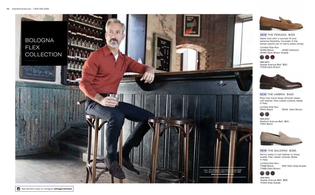
Allen Edmonds
Large dramatic image stops the eye and provides a focal point. Limited choices (3) keeps the shopping experience simple and easy. Copy is kept to a minimum.
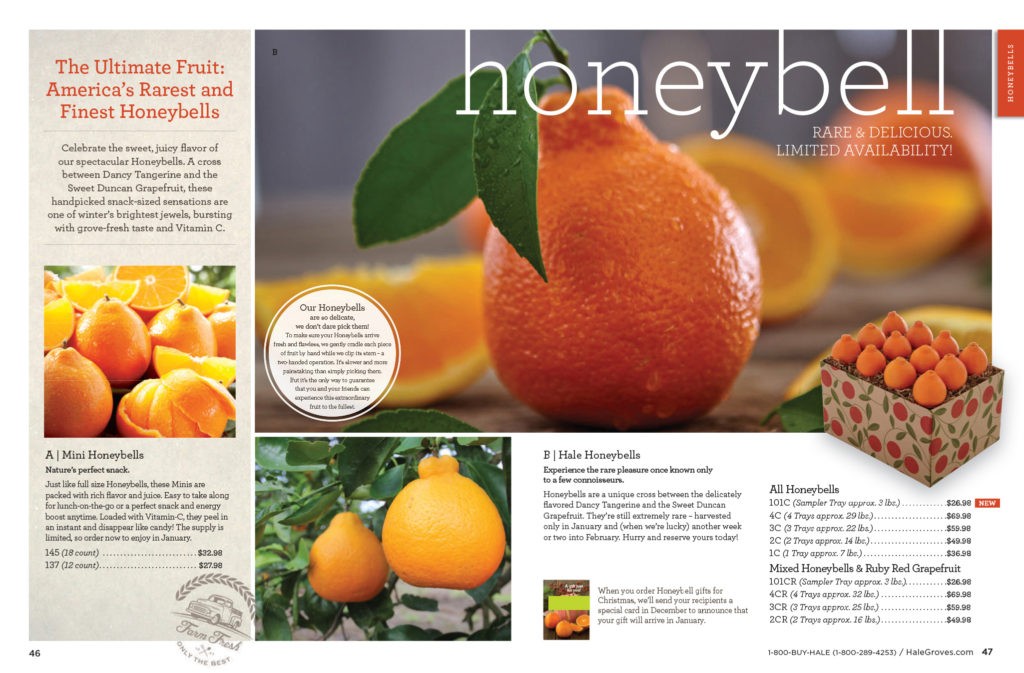
Hale Groves
Multiple layers of messaging (headline, subhead, branded copy, product copy, inset benefit copy) are all presented is short soundbites, making it scannable and easy to read.
The concept of clear, concise communication being most effective is nothing new. As far back 1657 the French mathematician and philosopher Blaise Pascal wrote about the value of brevity. But the most quoted reference is Mark Twain who reportedly wrote: “I didn’t have time to write you a short letter, so I wrote you a long one.” In that spirt, I apologize for not writing a shorter post.
Tags: #breakthroughcreative, creative, Creative Strategy, marketing strategy, neal schuler, simplicity